Fowl & Fodder
Refining Farm-to-table
Fowl & Fodder was already a staple in the Toledo food scene by the time I was brought on to rebrand the restaurant. With delicious offerings made with locally sourced ingredients, they had built a reputation for quality eats in the 419.
The brand hinges on the “fowl ampersand” borrowing the typographic features of Brandon Grotesque to assemble a glyph that matches the typeface while being a chicken and ampersand simultaneously.
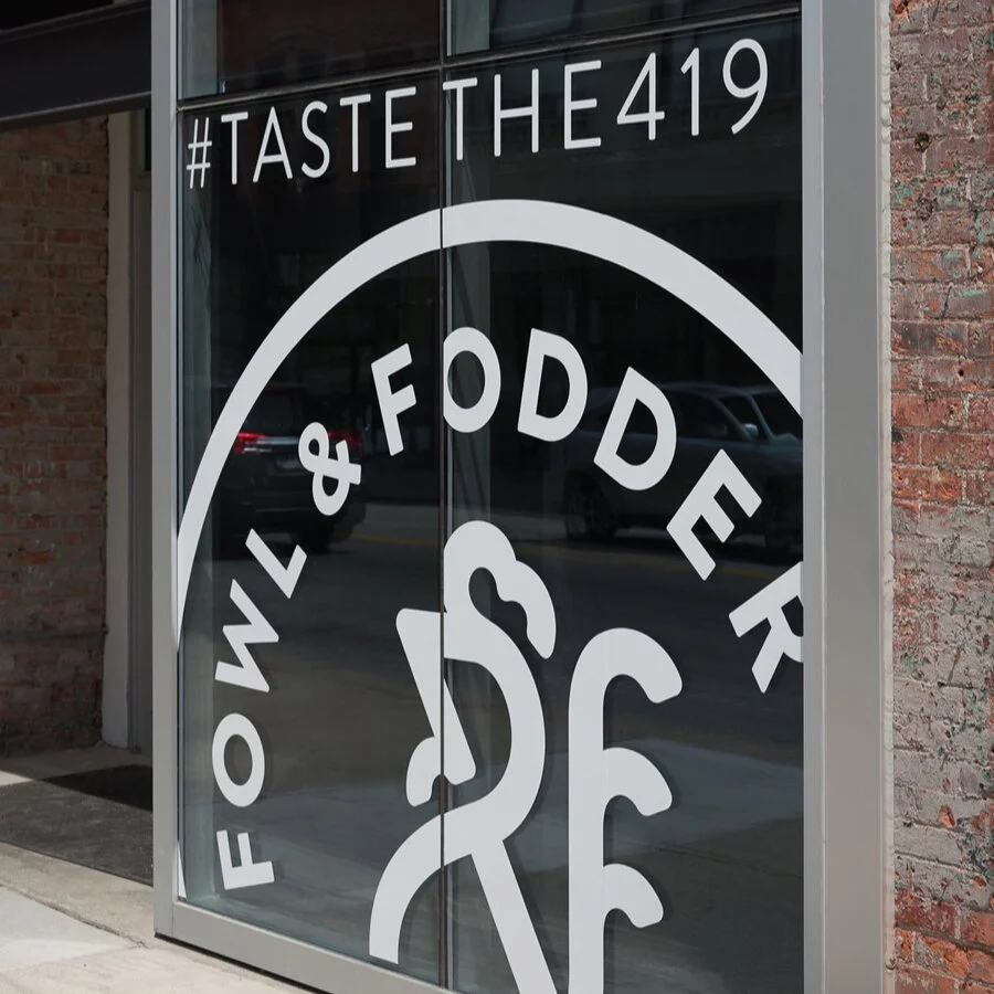
Keeping a very clean simple look was important to them, and with a few varying arrangements of the type and glyph, a system was put into place to apply and open up for hungry guests.
Taste the 419
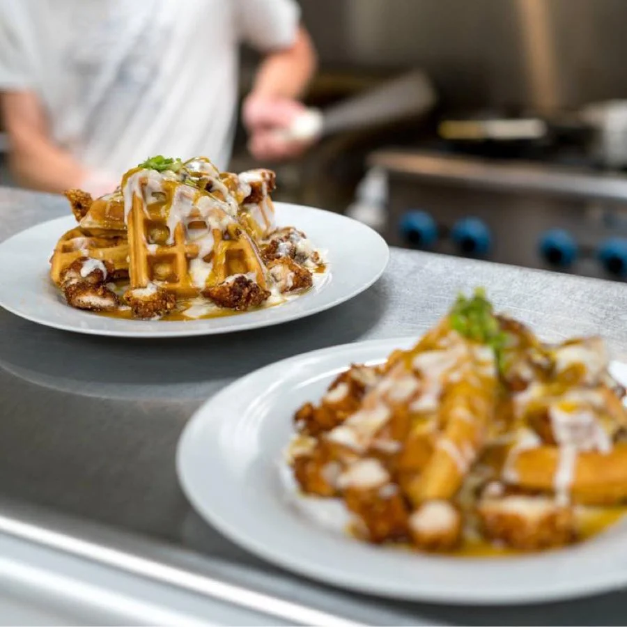
Fowl & Fodder’s menu shifts over time with the supply of local ingredients. But one dish that will always be famous in town is the Chicken & Waffles. Incredibly good, and one of my favorite meals of all time.


